A dashboard is only as trustworthy as the data underneath it. Real-time BI only creates value when the inputs are refined, reconciled, and traceable first. K.IOP feeds dashboards directly from its Data Refinery, so your KPIs reflect reality rather than raw noise.
Every organization wants dashboards. Executives ask for a single screen that shows revenue, pipeline, service levels, and stock in real time. Teams build them, the charts look sharp, and everyone nods in the demo. Then someone notices the revenue number does not match finance. Someone else spots a customer counted three times. Trust evaporates in a single meeting, and the dashboard quietly gets abandoned.
The problem is almost never the visualization. It is the data feeding it.
Why is a beautiful chart on bad data a "confident liar"?
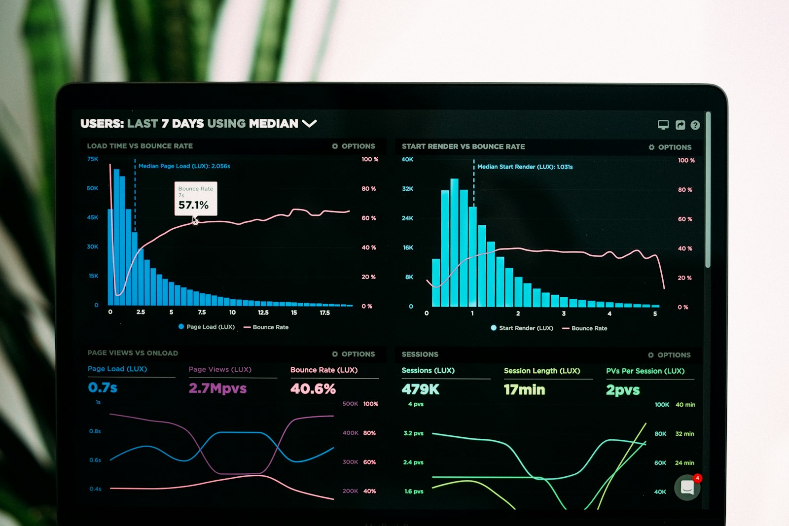
A chart is a persuasion machine. A clean line trending upward feels true. A gauge sitting in the green feels reassuring. That confidence is exactly the danger when the underlying data is wrong.
If your source records contain duplicates, mismatched identifiers, stale values, or unreconciled figures, the dashboard does not warn you. It renders the noise with the same polish it would render a perfect dataset. You get a confident liar: a visual that looks authoritative while quietly reporting fiction.
Common failure modes hiding behind a nice interface:
- The same customer appears under several spellings, inflating counts.
- Two systems disagree on a figure and the dashboard silently picks one.
- A record was updated last quarter but the pipeline never refreshed it.
- A KPI aggregates across categories that were never standardized.
None of these are visualization bugs. They are data bugs, and no chart library can fix them. And they are expensive: Gartner estimates poor data quality costs organizations an average of $12.9 million per year (Source: Gartner via Integrate.io, 2026). A polished dashboard does nothing to reduce that bill - it just hides it behind a green gauge.
Does "real-time" actually help if the data is dirty?
Real-time is often sold as the headline feature. But speed only multiplies whatever you feed it. If the inputs are dirty, real-time means you are wrong faster and more often.
Even the leading BI platforms build in cadence limits rather than truly continuous streaming: Power BI, for instance, allows up to 8 scheduled dataset refreshes per day on Pro and up to 48 per day on Premium or Fabric capacity (Source: Microsoft Learn, 2026). "Real-time" is always shaped by the pipeline behind it - which is exactly why that pipeline has to be trustworthy first.
Real-time genuinely matters - but only after the data layer is trustworthy. The right order is:
- Refine and reconcile the data so it is correct.
- Govern it so corrections are consistent and auditable.
- Then stream it into KPIs that update live.
Get that order wrong and you are simply broadcasting errors at high frequency. Get it right and real-time becomes what it should be: an early-warning system you can act on with confidence.
What does trustworthy real-time BI actually require?
Good dashboards are the visible tip of an invisible discipline. Underneath, five things have to be true.
- Refined, governed inputs. Data is cleaned, deduplicated, and reconciled before it ever reaches a chart.
- The right chart types. Different questions need different marks - trends, comparisons, distributions, single values.
- Global filters. One control that reslices every chart at once, so the whole board stays coherent.
- Threshold alerts. KPIs that tell you when they cross a line, instead of waiting for someone to notice.
- Traceability to source. Any number can be traced back to the records and transformations that produced it.
Miss the first and last of these - refined inputs and traceability - and the middle three just make errors prettier.
Want dashboards your leadership actually trusts? See how K.IOP connects refined data to real-time KPIs.
What about Power BI and other generic BI tools?
Power BI is a strong, mature product, and for many teams it is the right choice. Microsoft has been named a Leader in the Gartner Magic Quadrant for Analytics and Business Intelligence Platforms for the nineteenth consecutive year in the 2026 evaluation (Source: Microsoft / Gartner, 2026). This is not an argument against it. It is an argument about where the hard part of BI actually lives.
Generic BI tools are visualization-first. They are excellent at taking a dataset and turning it into interactive, shareable reports. What they assume - reasonably, given their scope - is that the dataset arriving at their door is already correct. They visualize data as-is.
But in most organizations the dataset is not already correct. The hard, expensive, unglamorous work is the data layer: cleaning, deduplicating, reconciling conflicting sources, and keeping an audit trail so people believe the result. That work sits upstream of the chart, and it is where teams struggle most - in Anaconda's survey, data professionals reported spending on average 45% of their time simply getting data ready, loading and cleansing it, before any modeling or visualization could begin (Source: Anaconda, 2020).
So think of it less as a rivalry and more as a division of labor. If your team is fighting dirty data before every report, the answer is not a different chart tool - it is a governed data layer. K.IOP positions its dashboards as an alternative for exactly those teams: not because the charts are fancier, but because the data beneath them is refined by design. For a team drowning in reconciliation work, that is the difference that matters.
How does K.IOP feed dashboards from refined data?
K.IOP is the data governance and operational intelligence platform of the K-Technology & Services group. Its model is simple to say and hard to fake: Connect, Refine, Operate.
The Data Refinery, also called K-Refine, does the upstream work deterministically. It cleans, deduplicates, reconciles, and audits data with a full audit trail and zero hallucinations. Deterministic matters here - the same input produces the same reconciled output every time, and every decision is recorded rather than guessed. That is what makes a number defensible in a boardroom.
The Dashboards product then consumes that refined output directly. Because the KPIs are built on reconciled, governed data, the chart and the source finally agree. What you get on the surface:
- 9 chart types - line, bar, pie, pivot, table, area, column, gauge, and number - so each metric gets the mark that fits it.
- Drag-and-drop composition, so building a board does not require a specialist.
- Global cross-chart filters, so one selection reslices the entire view and everything stays consistent.
- Tags and favorites, so the boards people rely on are easy to find.
- Threshold alerts, so a KPI crossing a limit reaches you instead of waiting to be spotted.
The point is not that these features are unique in isolation. It is that they sit on top of refined data with a traceable lineage - which is what turns a pretty chart into a decision you can stand behind.
What belongs on a checklist for trustworthy dashboards?
Before you trust any real-time board, walk through this short checklist:
- Is the data refined first? Cleaned, deduplicated, and reconciled before it reaches the chart.
- Can every number be traced to source? A visible path from KPI back to the underlying records and transformations.
- Is the logic deterministic? The same inputs should always yield the same figures - no silent guessing.
- Is there an audit trail? Someone should be able to see what changed, when, and why.
- Do the chart types match the questions? Trends on lines, comparisons on bars, single values as numbers or gauges.
- Do global filters keep the board coherent? One control reslices everything, so no chart drifts out of sync.
- Do critical KPIs alert on thresholds? The board tells you when something breaks, rather than the other way around.
If a dashboard fails the first two, fix the data layer before you touch the visuals. Everything else is cosmetics on an unreliable foundation.
FAQ
Is K.IOP a replacement for Power BI?
It can be an alternative, especially for teams struggling with dirty or unreconciled data. K.IOP's advantage is not fancier charts - it is that dashboards are fed from a governed Data Refinery, so the numbers are trustworthy by design.
What does "real-time" mean if the data still has to be refined?
Refinement happens deterministically upstream, then refined data streams into live KPIs. Real-time reflects reconciled reality as it changes, not raw, unchecked records.
What chart types does the Dashboards product support?
Nine: line, bar, pie, pivot, table, area, column, gauge, and number. You build boards by drag-and-drop and apply global filters across every chart at once.
How do I know a KPI is accurate?
Because it traces back to refined, reconciled source data with a full audit trail and zero hallucinations. Deterministic logic means the same inputs always produce the same figures.
What are threshold alerts?
They let a KPI notify you when it crosses a defined limit - a stock level, a service target, a revenue floor - so problems reach you instead of waiting to be noticed on a screen.